Types, Genres and Conventions of Advertisement Campaigns.
Advertising Campaign Aim/Purpose -
Clear Benefit,
Solution to a Problem,
Common Ground,
Fulfil a Need.
Advertisement Genre and Conventions -
USP,
Celebrity Endorsement,
Shock Factor.
Advertisements ae based largely from the purpose of the advert. This come from the aim/purpose of the promotion, which can be one of four types. There is common ground, clear benefit, solution to a problem or to fulfil a need.
Common Ground:
For example, a common ground advertisement is a video such as the B&Q build a life campaign, which has relatable and natural content, as well as being largely focused on families which everyone is a part of. These advertisements also generally use direct address, with words such as 'you' being used very commonly. This type of advertising is used commonly with larger products such as cars and homeware, as they like to promote them to families often as they are more expensive products. Direct address in adverts also has a very different feeling to their advertisements, and people feel a closer relation to the advertisement and product because of this.
Clear Benefit:
An advertisement with a clear benefit is when a product is promoted with a clear reason why it is better for you, or better than other products. A good example of this is Apple. Apple's adverts solely rely on showing off their features and contents, such as when iPhones are promoted for their processing power and camera quality. This is used to promote a product in an obvious, outright way. This is giving an audience reasons to buy a product, as it can better their life in a specific, or larger way. This is usually the most common form of advertisement among technology such as phones, laptops, TV's and even cars in most cases, as they show why their vehicles features are better.
Solution to a Problem:
Advertisements which create a solution to a problem is when they will often raise a common issue in the advertisement, resonate with the audience about the issue, and then show how their product is the best solution to the issue. For example, Gaviscon advertisements always follow this route, as they show the problems with heartburn, and give statistics and evidence about the negative reactions of heartburn, and then show with a short animation how their product completely solves this issue, and relieves the pain from the heartburn. This is a perfect example for solution to a problem, but advertisements that promote products such as moisturiser and skincare often follow the same path.
Fulfil a Need:
Advertisements that fulfil a need are much more simple than the other genres presented, as it is simply promoting something that the audience feel a natural need to have. a good example for this is food and drink advertisements, as food and drink is a need for the human body, and the advertisements for these are often extremely simple, as the audience already have a constant need for the products they are promoting, and all they need to show is why their product is unique and differs from the competition. Another example of fulfilling a need is travel advertisements, such as buses and trains, which fulfil a daily need for some people to travel, which most people do everyday to work. In conclusion, these advertisements offer their own ways of completing a daily task.
Advertisement Choices -
My advertisement choice is to fulfil a need. I have chosen this type of advertisement aim to conform to the standard advertising pattern for food and drink. This is because it is a more simple way of advertising which works much better with simple products which are a human necessity. For example, brands such as Fanta and Oasis will use fairly generic advertisements to get their point across, as the point of the product is completely obvious. This means that more time can be spent on the advertisement stylistically, and solidifying a theme and lifestyle that the product promotes.
This also works for Bubble and Fizz as a product, as it is a simple concept, and has a specific target audience. This means that the advertisement will be more stylistic. The drink is a non alcoholic, but classy style. This means that I can create a lifestyle surrounding the drink through the advertisements, and use this as a means of promotion.
This also means that I can create a simple punchline, which does not have to revolve around a specific meaning or purpose. For example, I can create a short and memorable slogan, which is more likely to be picked up from an audience. This means that sales would be more likely, and therefore the purpose of the advertisement would be more fulfilled.
Target Audience -
The target audience for this brand has been chosen by the client and is present on the client brief we have been given. The target audience of the brand has been identified as '18-24-year-olds who are health conscious and enjoy outdoor activities'. This means that the drinks brand should be designed to meet these requirements, and to also suit the demographics of the consumer, which is the selected target audience.
Competitors -
This will compete with brands such as Oasis and Fanta, as they use the same style of advertisement that I am aiming for. For example, Fanta advertisements follow a very natural and fruit driven theme, which is the theme of Bubble and Fizz. They also use less text than other competitors, usually with one catch line at the side. This is very similar to the advertisement I aspire to use, as it shows the natural flavour theme that the Fanta drinks embody.
There is a two call to actions in this advertisement. The first one is the logo, as when people see a logo they immediately associate that with the chosen product, and it reminds people of the drink so that it will stay in the forefront of their mind. The second use of call to action in this advertisement is the link to the Fanta website that is used on the bottle. This means that people have a quick way to learn more about the drink if they would want to, which will make the advertisement more successful.
This advertisement is also a very bright colour. This means that it will stick out much more than brands such as Pepsi and Coca Cola, who tend to use darker black and white colours. This makes it stand out on a billboard, or a social media advertisement as people cannot miss it. This is the style I will go for in my advertisement, as it means that the response to the advertisements will be more positive as more people are likely to notice it.
I researched Fanta's target age demographic and found out that they promote towards 15-17 year old's and mothers. This is a very slim audience but makes sense for the brand, as they are a much more modern brand, yet aren't quite as popular among kids and adults as brands such as Coke and Pepsi. I will use this style for advertising as my target audience are a very similar age group to that of Bubble and Fizz's age group.
This advert was mainly used to promote Fanta's fruity taste, much like coca colas iconic taste, Fanta has always been known for being a fruity soft drink. This immediately makes it more interesting than a standard Coca Cola advert with the colours used and different flavours presented.
The ideas I can get from this advert is that I should revolve my brand around being fruity and natural. this separates it from competitors and links to the healthy and active target audience, whilst still remaining interesting and tasty. I will also use a lot of colour in my advertisement. This means that it is immediately eye catching and has a grasp on the viewer as it is interesting to look at. I will also use direct address, for example using 'you' to immediately create a relationship with the viewer and the product.
Fanta's Logo -
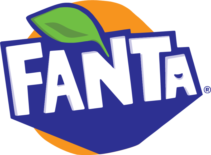
Fanta's logo is very simplistic, and highlights on the main selling point of the brand, which the fruity 'twist' they have in their drinks. The idea of the logo is to have a fruit in the background, that surrounds the image, which immediately makes the text the focusing point of the logo. The leaf is used on this logo again to resemble fruit, which is their USP compared to other drinks of the same category.
The use of colours is also very important here, as they are very natural and flat colours. This has a cartoon-like style which is perfect for the age audience for the brand, as they are younger and would prefer a more modern, more fun style for a drink.
The bold text also highlights this theme, as they are not classy or elegant. It is a more childish and a standout brand, and they want to make that as obvious as they can through their logo.
This is a perfect example for a logo I should aim to feel like with the Bubble and Fizz brand, and I will use this as influence towards my logo design.
Bubble and Fizz Logo -
I have chosen a logo similar to the idea presented below as my idea. I have three options so far for styles of my logo. All of these logos revolve around oranges as the main fruit for the drink. This makes sense as the brief says the drink colours should be pink and orange, so I already have the orange theme in my logo. I will need to add a pink style or a pink fruit in my logo to make it more suitable to the brief but this is a good start.
Bibliography -


Comments
Post a Comment