(P2) Planning of a Cross Media Campaign
Name: Cody Watkinson
Date: 25/01/23
Title of product being advertised: Bubble and fizz.
Aims of brief: Increase sales of Bubble & Fizz by 10% overall.
Objective of Brief: Increase sales by 10% in one month and heighten the awareness of the brand amongst the target audience.
Target audience of brief: 18–24-Year-olds, health conscious and enjoy outdoor activities. Explorer psychometric.
Section 1: Evaluation of Brief
Client Brief Issues - The logo must be completely finished in 7 weeks and within a budget of £10,000. This means that there must be budget restrictions to fit in the chosen amount, and generous planning should take place to make certain that the advertisement will fit between both of these listed constraints.
They will also have to abide by the Laws and Regulations set for advertisements, for example, I will have to abide by the ASA's set of rules and guidelines for advertisements in the UK. For example, they would need to stick to copyright, by making sure they do not use any copyrighted material In the video that could get them in trouble. They should also not say anything about other brands in their advertisements to avoid libel or defamation charges, for example, comparison of products would not be appropriate within this advertisement as it risks being taken negatively by that company.
The target audience here is 18-24 year old's. this means that the brand should have a distinct feel to it, and have a 'fun' element to it which makes it more suitable towards a younger age group. The drink should also be a modern, and slick design. This means that it would be more suitable towards the correct age group as it follows the modern trend that young adults tend to stick by, therefore if they see people with the drink they will immediately take interest in the design and idea of the drink, as many of these people have the 'aesthetic' ideologies.
Section 2: Generation of Idea
My interpretation of the brand would be a very bold, but smooth design. For example, I would want something similar to Dunkin’ Donuts as the logo, as it is simple, modern, eye catching and bold. I would also use bright and colourful shades to promote the fruity taste of the drink, and make it look more natural. I am using a Mood Board and a Mind Map to generate more ideas from the internet, and group the theme that I will be trying to achieve. The theme must stick to the target audience that has been chosen, meaning it should have a healthy, natural feel to it. However it should also have an element of fun to it so it can suit more towards a younger audience.


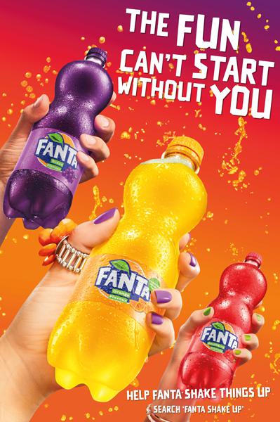
This is Fanta's fruit twist 'shake things up' campaign. The aims of this advertisement are to promote different flavours of Fanta in a fun way. This advert uses a mash up of all the colours from the flavours of drink to remain eye catching.
This advert was mainly used to promote Fanta's fruity taste, much like coca colas iconic taste, Fanta has always been known for being a fruity soft drink. This immediately makes it more interesting than a standard Coca Cola advert with the colours used and different flavours presented.
The ideas I can get from this advert is that I should revolve my brand around being fruity and natural. this separates it from competitors and links to the healthy and active target audience, whilst still remaining interesting and tasty. I will also use a lot of colour in my advertisement. This means that it is immediately eye catching and has a grasp on the viewer as it is interesting to look at. I will also use direct address, for example using 'you' to immediately create a relationship with the viewer and the product.
Section 3: Campaign Plan Creation
My idea for the advertisement and brand name is to keep it simple. I will have a Bold and simplistic logo, along with flat colours and gradients to match the modern and simple feel of the drink. I will also base the design around types of fruit for the flavours, this means that it sticks to the target audience, as it makes the drink feel healthy but also has the large element of taste which is needed with a drink.
My advertisement will be used on billboard, on social media and on a short TV advertisement.
Key Messages -
The key messages of the advertisement are to have a 'healthy taste'. This promotes the drink to the target audience whilst also being quick and catchy, and sticking in the forefront of peoples minds. This will also work well with the target audience, as they need to be the people who prefer healthier choices.
Stylistic Approach -
My stylistic approach to the advertisement is to be bold and simple, meaning that there is not a lot to remember. I would also want the audience to associate the colour scheme with the drink, so the colour by its self will remind them of the drink, which acts as free advertising. I will have simple illustrations of fruit on my drink to show which flavour the drink is, which will also be reflected by subtle changes in colour, but maintaining the pink and orange colour theme on top of everything else.
Call to Action -
The call to action that I will be using on my advertisement is a website link, as well as a logo with a small barcode. This means that people can easily scan an advertisement and read quick information about the product so there is more opportunity for promoting the product. This will, be continuous throughout the different types of media advertisements.
Direct Address is a good form of call to action, as seen here in this cross collaboration between coca cola and the James Bond Film Series. This uses the brand name of James Bond as well as the direct address of 'you' to aim straight towards everyone who sees the advertisement. This means people are more likely to act on the advertisement, as they will feel 'special' from the address of the advert.
This is a more comedic call to action, which does not have a straight call to action on it, rather an inferred message from Oasis. The idea is that they use the humor of them having to reach sales targets to engage a customer in the advert, so they think about buying Oasis and it will stick in their minds until next time they are buying a drink.
This acts as a call to action in the advertisement as it gives the customer something to do next, which is to go and buy an Oasis. This is a very simple yet effective call to action method. The logo used on the bottle is also purposeful to promote brand name.
Media Choices -
My media choices for this campaign will be Billboard and Social Media, as well as a TV advertisement.
This means that I can impact a large audience, both people who use technology and social media, as well as people who do not use any of them. This is useful as it means that the product reaches a larger range of people, which impacts the target audience positively.
Campaign Schedule -
My advertisements will be in the bursting model. This is because the drink will be promoted in the summer exclusively. I chose this as this is when people prefer more refreshing drinks and when people are healthier and eat healthier, as opposed to the holiday times when people are not as healthy. This means that the product is also more likely to reach its target audience, as in the summer timeframe it is a larger group of people.
Launch Format -
I will initially launch this advertisement on social media as a static post, it will not be a video. This is just a quick launch to raise awareness of the brand, and maintain the budget so it can be used better when the brand has more popularity. This advertisement will just have a release date, and the drinks with their flavours alongside the key messages of healthiness.
Mood Board -


Comments
Post a Comment