Posts

(P4) Create the Media Components to be used in the Advertisement Campaign
Image
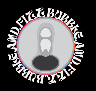
Bubble and Fizz Logo -  This is the competed version of my Bubble and Fizz logo. I made sure to use a square template so that I can make sure that the sizes are correct. The finished product is in a 1:1 aspect ratio and has a pixel density of 1080x1080. This logo turned out nicely and also includes the orange and pink colour scheme which was explicit on the brief. Social Media Advertisement Video -  This is my Social Media Video Advertisement. I created this video in 1080x1080 as it is one of the official Instagram sizes, where this advertisement would be. I have rendered the video in this quality so that it will look good on Instagram, and the video quality is professional level. Video Rendered onto an Instagram Post -  This is my social media video imported onto a mock Instagram post. Unfortunately I could not change the text underneath the post so as for now it just says template. Once again this was rendered at 1080x1080 in a 1:1 format. Final Billboard -  Billboard Rendered onto R

(M1) Evaluating Different Cross-Media Advertising Campaigns

Image
  I am writing this report to evaluate and compare two examples of cross media campaigns from two different brands. I will explain here the differences between the two brands, and how they could be improved to match their purpose of the campaign better. I will also discuss the different target audiences of each product and how they apply to their target audiences. Fender American Professional Advert -  This is a campaign promoting fender guitar products. The main focus on this advertisement is by using famous music icons that have used fender products to promote the success of their previous products. This campaign used photos to advertise online, these photos linked to the idea that the campaign brings as they used guitar cords to pin the photos to a wall. This has a partial link to the continuity of the physical advertisement, as the billboard states the names of the figures that have been used in the online advertisement.  Fender's target audience are very specialised. Their gui

(P1) Describing Existing Marketing Campaigns

Image
 Headings - Aims and objectives, target audience, key messages, approaches and representation. B&Q Build a Life advertisement campaign (2020) Aims and Objectives The aims of the B&Q Build a Life include bringing families together and promoting their product. They target their campaign hugely at families, as the whole campaign is used to promote families building their memories together in their homes. The point of the campaign is to bring families together in an otherwise hard time, in spite of the rise of COVID and people had to stay inside, losing the opportunity to go outside and make memories themselves.  B&Q took this time and made it into something positive, as people can craft their homes and their lives in a time when they can't go outside, they can create somewhere to enjoy the time they have, and use it to also better the place that they live in. The objectives they aimed to achieve with this campaign was to increase their popularity, as well as trying to grow

(D2) Demonstrate how the advertisements design links to the brief

Image
Throughout the creation process of my different advertisements, I made sure that the designs followed both the strict and more vague comments from the client brief. This was evident with certain styles throughout all of my advertisements, and makes sure that the client will be happy with the advertisements as they link back to the client brief. Can Design and Logo -  The first design I started out with was my logo and can design. This is because these were the smallest tasks to do, whilst also being some of the most important. I found a 3D render of a can online for free, and used that as the base of my can design. This was good as it means that I have the exact measurements of what size the can design frontage will be, and I am completely certain that it will fit on the can.  This is the blank template for the can design. I started this design on Adobe Photoshop, as it is the best to use for editing and design, I also later used Adobe Illustrator which is also very good for designs. I